One of the first things I remember learning at University were the Design principles. These are the “rules’’ to consider when designing to help you create a well-designed space. Obviously, they can be bent, but it is a guide to help people make choices with confidence.
Have you ever walked into a space and regardless of whether the décor was your taste or not, and thought this works? That is probably because the design principles had been used.
These principles can be used no matter what style you would like to go for. They are always important, but some are more relevant to various styles.
Following these design principles, along with some knowledge and an open mind to trying new things will help you create a great space.
So, let’s get on with it. The design principles are Balance, Emphasis, proportion & Scale, Harmony, and Rhythm. Your thinking what??
Well let’s start with an easy one Balance. Balance is really important as it creates a sense of equilibrium. It is about creating a uniformity through the variety of objects. Balance can be achieved through several different mediums, colour, pattern, texture, and of course shape/form. Let’s look at these in more depth. When it comes to colour, this can be achieved easily if it is done correctly. For example, if you are doing a dark floor, its best to go with lighter walls to achieve some contrast. Having a few tones of the same shades can help add interest to the space and start building layers. Pattern is great for lifting the space from being flat and drab to fun and a bit dramatic. Texture again, adds more layers and depth to the look. It helps achieve a sense of warmth and texture. It tells a lot about the calibre of room it is. Lastly, the shape of something is also important. Think about it, how strange would it be if we were in a room where every item is round or square. It would look very strange. Therefore, sometimes it is important to have a variety of furniture to work with.
There are three types of balance: Radial, Symmetrical and Asymmetrical. Let’s understand each of these.
Radial balance is accomplished when there is a focal point centrally where other items are located around it. Take a look below.
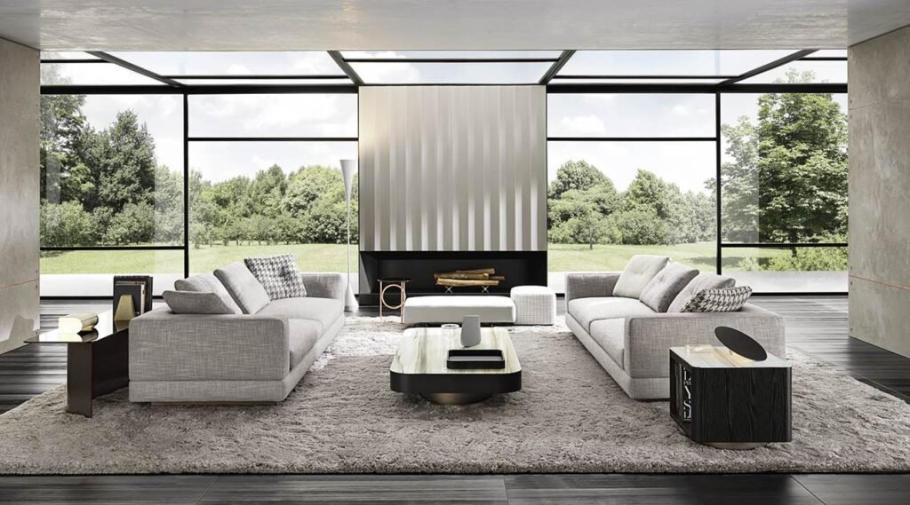
Designed by Rodolfo Dordoni for © Minotti London
Asymmetrical Balance is a little different to symmetrical as it is not all about exact duplication of items or finishes. In terms of layout plans, you would not mirror exactly what is on the opposite side of the room but would essentially balance it out. Take a look at an example above.

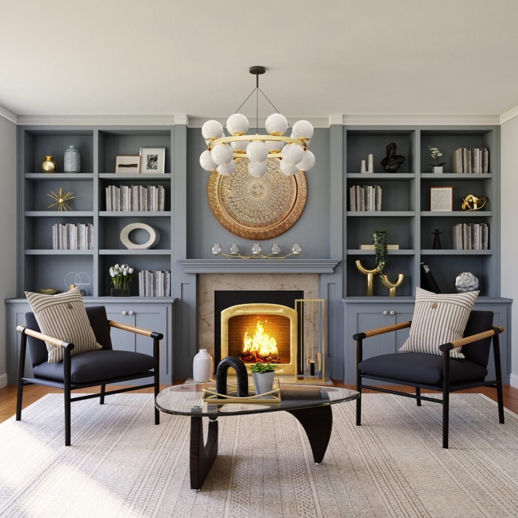
Symmetrical balance is all about mirroring something exactly. This look comes from the Georgian period and suits older more traditional styles of interiors, not just Georgian. It is easy to achieve as it is all about repetition. This is a look that can be too formal and strict for some people. Below is an example of symmetrical design. Notice how almost everything is mirrored and if it were cut through, there would be no differentiation.
Let’s talk Emphasis, well it is all about making something stand out. This can be done in several different ways, be it a product, a finish, a fitting/appliance or even a texture. Emphasis could be that feature wall with a huge fireplace or that great table with the giant pendant hanging above. It could be a mural or some dramatic wallpaper on one wall. It could be some beautiful fitted furniture in the living room or even a patterned sofa.The below image shows a patterned floor which would be the emphasis of this space.
.

Rhythm is about having a sense of flow in a space, just like music flows, repeating some elements such as the colour or the shape of an item, but with bursts of something new here and there. Just picture a heartbeat and that is what rhythm in design is all about.
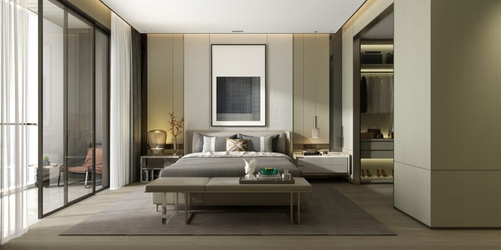
Proportion and Scale is super important to creating a design that makes sense and flows. It helps elements not to stand out for the wrong reasons. Proportion is to do with the size of one component of an item compared to another part. For example, a table with huge legs and a tiny surface, would not be proportioned well from both a functional and aesthetic point of view. Scale is also to do with relative size and a good example of this would be having appropriate sized furniture for a space. Imagine having a dolls house with human sized furniture, obviously this is a huge exaggeration, but this is the easiest way to explain this. Below you can see that this sofa in comparison to the chair is not in proporation to the sofa.
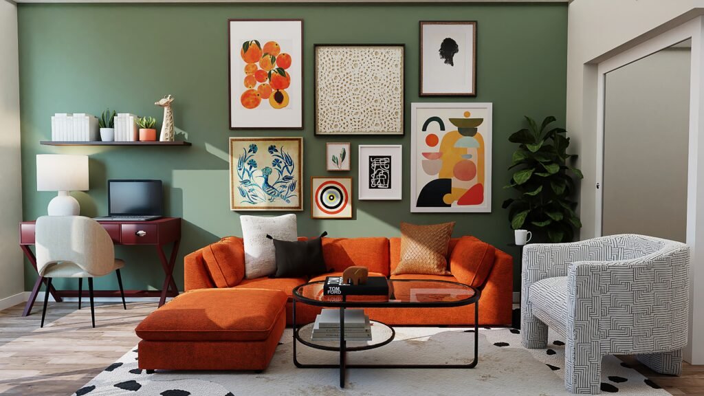
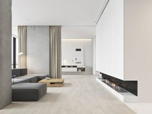
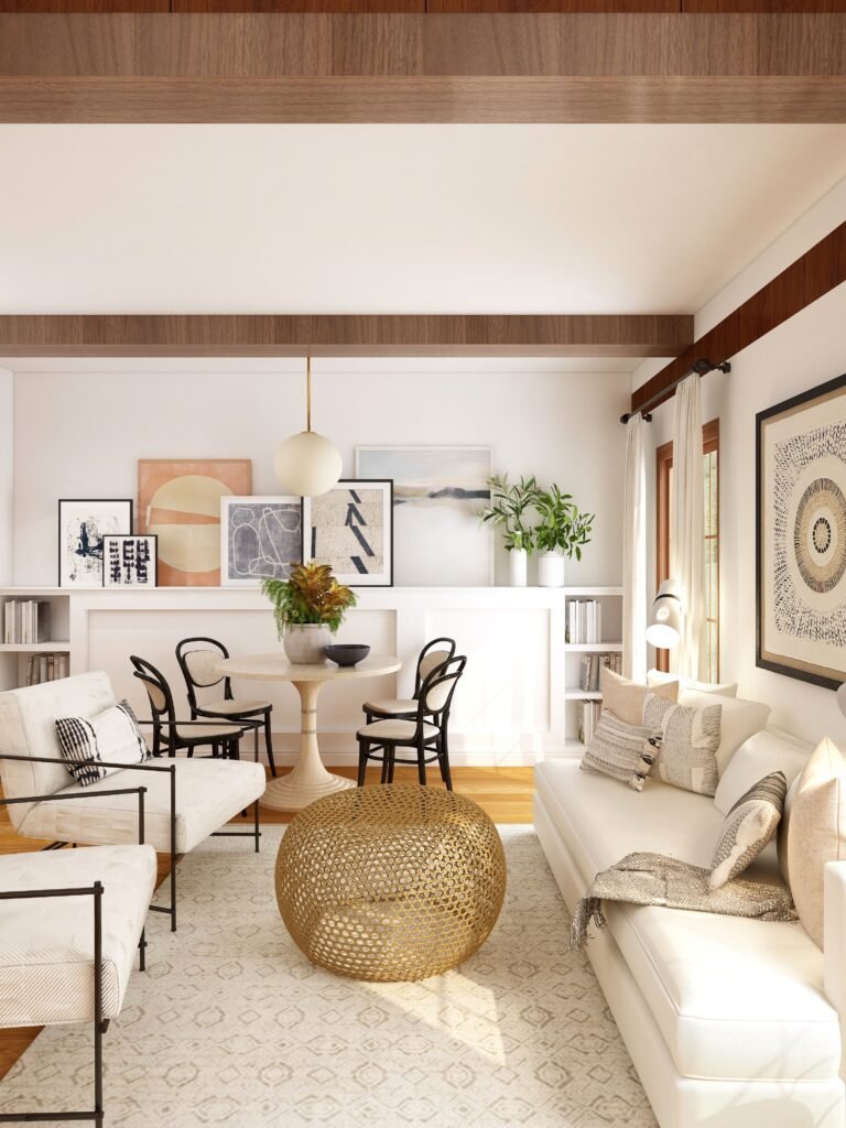
Harmony is an atmosphere, it is the feeling you get from a space due to the nature of the interiors. A harmonious interior would be a space where all the elements work together to create a calming experience. Spaces that have been designed in a style such as classic, minimalist, contemporary are usually harmonious due to them being well planned with neutral tones and unified in one look as listed above.Below is an example of a harmonious interior which works really well.
Photo by Collov Home Design on Unsplash
If you follow these guidelines and examples, you are sure to have a much better outcome for your space, if it all feels a little overwhelming , then get in touch! Let me help!

